Things that Make Your Website Look Crappy
Building a website on your own for your small business or freelance opportunity seems like a great idea for cash-strapped entrepreneurs but have you ever come across a website that was so bad that it was good?
Your website is your digital address and it has evolved from just a placeholder to a full-fledged tool for business growth. From selling products to marketing it has become one of the very core components of any business. Your website is like your storefront, it should be so visually appealing that it should make people want to enter and take a peak around but if it looks like a hot mess people will bail right out increasing your bounce rate.
Well, today we will be taking a look at things that make your website look crappy and things that you should avoid at all costs when making your website.
Mistakes to Avoid When Making your Website.
1. Using All Black Color Scheme

We have all grown up reading books and they are generally printed on white paper with black ink for the typeface and this has led us to hardwire ourselves to prefer black on white instead of the other way around. When computers first came around, they were monochrome. This meant having a black background with green text on it, imagine seeing that every day, new.
The reason black-on-white works so well is that you can make out the text without anything else to distract you from the main content. A good number of websites have taken the standard guideline to heart and use black on white but some websites still exist with a light typeface color and a dark background which make them look like nothing but an eyesore.
If you are still hell-bent on having a dark background then make sure that you leave enough whitespace, and have a well-balanced contrast level while using a pleasing font in a size larger than you normally would, this will ensure proper and easy readability.
2. Using Outdated Templates

If you plan on using a template for your website you may want to reconsider your options. There’s nothing wrong with using premade templates but often these templates are old and outdated which means it’ll make your website very slow and stagnant and not responsive and dynamic as you would like it to be.
You can either get HTML templates or you can use a CMS like WordPress. WordPress as a CMS is free to use and offers so many additional functionalities that you would get tired of experimenting but the options wouldn’t run out.
While WordPress has a few themes you can customize, it is easier to just download a pre-built template and then customize the template according to the requirement.
Templates are very cheap nowadays and can be found for as low as US $50 (and even sometimes for free, if you know where to look for them) with prices this low there is no reason to use an outdated theme, so if you have a website using an old and outdated theme go and replace it with something modern and better.
3. Using a Poorly designed Logo.

Having a professional logo is extremely important for any business and when people arrive on your website it will be one of the first things that they notice. And a crappy-looking logo will make people think twice about the quality and trust of your product and service.
If ever a picture was worth a thousand words it’s your logo.
There is no excuse these days for not having a professional logo. You can create one yourself online using logo generator websites, and the quality is always good.
And if you prefer to have an actual real-life designer create your logo then you can use services like UpWork or Fiverr and get one done relatively cheaply.
4. Deadly Sins to avoid with Fonts
Fonts are important, extremely important. You should always pick a font that is easy to read and doesn’t strain the eye too much and it should be large enough to be easily readable even on smaller displays such as mobile phones. Here are a few sins you absolutely must avoid when choosing fonts.
- Do not use Tacky FontsDo not and I mean do not use fonts that are tacky and trendy, they look horrendous and irritate the eye as well as the brain. It also pushes your customers away, so do not at all use tacky fonts.
- Do not use fonts that are hard to read or messyFonts that are hard to read put off your reader and hence increase the bounce rate on your website, ensure the font you use is clean, minimal, and easy to read.
- Do not skimp on line spacingIf you space your lines at 100% (1.0 line space) it’ll be very hard to read, if you try and space it at 185% (1.85) it will feel too spaced out, use 150% space (1.5) which is generally ideal.
- Don’t use too many fontsUsing multiple fonts only increases the reading tension on the eye and fonts should be kept to a minimal number, ideally 1 and in certain cases 2 at most.
- Don’t make it too ColorfulWe don’t want our content to look like a children’s coloring book, do we? Stick to a couple of colors to ensure the content looks clean,
- Don’t use Non-uniform font sizesSeriously, never mix multiple font sizes unless necessary. You can’t just have a line in 12 pt and the next one in 14 pt, it just makes your work looks shabby and unprofessional. Try to choose one of these standard font sizes 8, 16, 24, 32, 48, 64, or 95 whenever possible.
- Don’t keep the content clutteredKeep enough white space to ensure optimum readability or your content may turn into a nightmare for people. Always remember, whitespace is your friend, not your enemy.
5. Using too many colors, especially bright ones
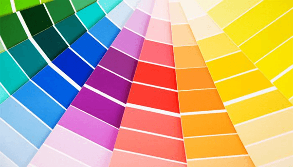
Unless you deal in paints your website shouldn’t have an excessive amount of colors. The website isn’t a garden that would look beautiful with multiple colors, you may have come across multiple such sites which have multiple flashy colorful accents all over but in the end, all these sites end up looking like you have just entered into a circus.
Any sensible designer will tell you that one bright color or two bold colors are more than enough to balance out the overall aesthetic of the website when it comes to website design always keep it subtle and sober. Your users shouldn’t immediately feel the need to put on a pair of sunglasses just to check your website.
Choosing bold or bright colors isn’t a bad idea as long as you know what you are doing and you can balance it out with other subtle lighter colors. It is often easier said than done though.
6. Having too many Advertisements

Advertisements are necessary for a lot of you bloggers out there who are looking to get a website your own. The ads we show on the website are our bread and butter and that is what brings food to the table but having too many advertisements is just a big annoyance.
When you have too many ads, especially of the pop-up variety it becomes a hindrance for your user who in turn exists the website never to return. Ads are not only annoying but they also slow down the page load times which will hamper many of your SEO efforts as well. Try to keep ads to a minimum, having too many flashy ads or autoplay video ads will result in a headache for the reader and nothing else.
Link shortener ads are another form of irritating ad which you shouldn’t even touch with a 10 feet pole, so steer clear of them as well.
7. Having Broken links and No Search Engine Optimization
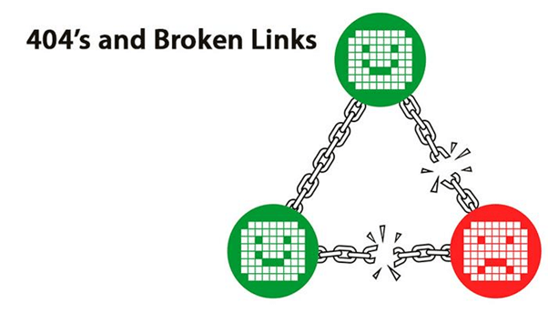
You will have broken links, eventually, there is no escaping it but you can minimize the number of broken links by following a few basic rules to ensure your readers don’t land on pages they aren’t supposed to.
- Don’t move around things once you place them somewhere
- Check the 404 error log regularly
- Redirecting broken links
- Using a link checker to check for dead links regularly.
Broken links get very irritating for the readers and may lead to the reader leaving and not returning to the website. Broken links also have an impact on the SEO of the overall website and many search engines penalize websites that have many broken links.
Search engine optimization is also very important as it helps your website to rank higher in the search results which in turn will help you move more products and beat your competition.
8. Bad Copy and No Updates
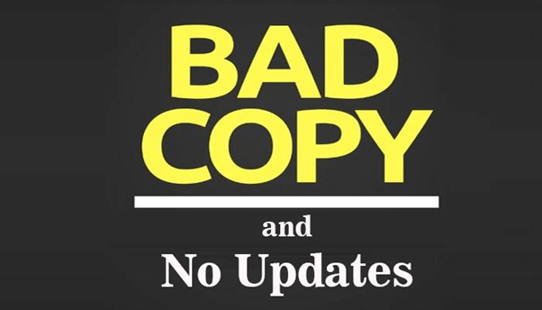
If you have a great-looking website with very vague and irrelevant content it will hamper your chances of reader loyalty. You must ensure that the content you use is error-free, grammatically accurate, and relevant to your website.
Not updating your content frequently is another issue that plagues well-designed websites. You should ensure that you keep your content updated as this also helps with search engine optimization.
9. CTA errors and No Way to Contact

Having a Call to Action (CTA) button works wonders for any website but having excessive and unnecessary CTAs will not only confuse the customer but also increase the possibility of having broken links and we already know that is nothing but a problem.
While CTAs can increase the number of people contacting you, having no apparent way to contact you via your homepage or through a dedicated contact page is another cardinal sin some websites commit. You by now know better and hence should not make the same mistakes others are making.
10. Having one too many pop-ups

Popups are annoying, plain, and simple, they are irritating to the readers and nothing but a nuisance overall, but we can’t deny the fact that they are quite important for a business.
Having a balanced number of popups is extremely important which not only helps you retain the readers but also helps you in improving their user experience.
So this was our list of things that make your website look crappy, we hope you learn from the mistakes others have made and don’t make the same mistakes they have. Do let us know if your website had any of these issues below in the comments.